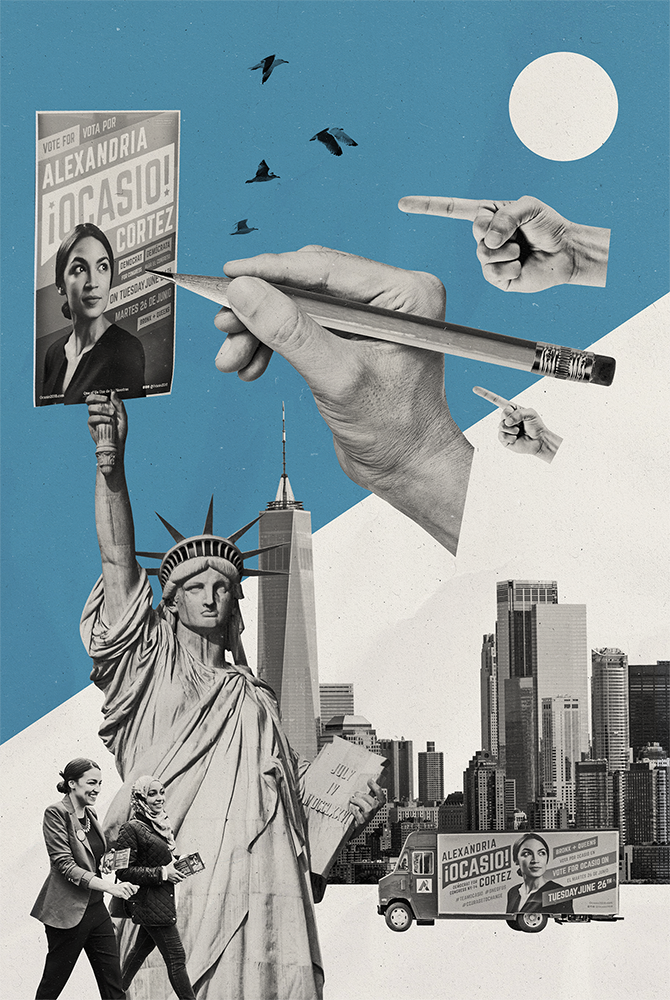
 Do you manufacture an image, or do you create one? Before you do anything, first, listen to the story. On trust and authenticity in politics, marketing versus propaganda, and storytelling in public perception. We talked to Scott Starrett, co-founder and creative director of Tandem Design NYC, a 5-person graphic design firm (and also the same firm behind the design for the now-famous Alexandria Ocasio Cortez campaign in 2018).
To give our readers some background, can you tell us a bit about how it all got started for you—becoming a designer and launching Tandem?
Sure. I went to the University of Kansas, where I studied Illustration and Graphic Design. My business partner, Shaun Gillen, studied Photography and Video at SCAD in Atlanta, Georgia. After graduating, we each worked some jobs that were somehow related to design. I was operating more on the marketing side of things; he was doing design work for a non-profit. He then moved to New York and started working with his uncle in the city. I moved to Austin, Texas and started working in political communications.
After a while, that line of work really wears on you; I reached a point where I just wanted to step away from it for a little bit. I was in need of a break from that scene. When you’re working on a political campaign, there’s always this idea like, “Oh, I could put in a little more for the team,”or “This should be a labor of love.” For a volunteer, sure, it might be more realistic to have that mindset—when you’re showing up for a five hour block of time to help out. But when you’re on the slog of the campaign, it ends up really wearing you down.
I had always wanted to move to New York, as Shaun had as well. So, from Austin, I moved to NYC. By this point, Shaun was working in the design field, and I was eager to get out of politics. So, Shaun and I decided to start a creative studio.
How did you go about setting up Tandem? What were your intentions for this business?
Well, you don’t generally become a graphic designer with the intention of getting your name in the paper, right?
It was important to us to have a firm that can afford to set aside time to work towards causes, or to support things we believed in, or to come up with new and exciting ideas. We wanted to be able to use communication, and tenets of marketing, that work so effectively in commercial scenarios—and be able to apply them to do good things. So, we’ve had a lot of pro-bono and non-profit clients along the way in the mix, along with commercial clients. And we’ve just been bootstrapping and plugging away.
We had a mutual friend named Alexandria. She worked somewhere nearby to our studio, so we would see her often and we got to know her pretty well. It was 2016—a time where people were starting to talk openly about politics. So we talked a lot before the election, and then the election happened—and we were talking about it even more. It was mostly around, “How do we involve ourselves in this?” And just generally the idea of being active and somehow getting involved. I also don’t think we were alone in this sentiment—a lot of people were kind of looking at it and saying, “What can we do?” A lot of us started going to marches, and a lot of people started sending postcards to people, or just showing up at campaign headquarters.
It was fantastic to see people getting mobilized, and we just kind of knew we could support our friend and some of the organizations that she’s aligned with. We just wanted to be active, to be doing something. Like, “let’s just hunker down and let the status quo…”—actually, we’ll get back to the status quo. A lot of people are feeling uncomfortable and nervous about the future. We have to do something. The message can’t be “just sit still.”
So we jumped at the chance to contribute—to get involved. We put a lot of work in for Brand New Congress and Justice Democrats ahead of Alexandria’s congressional bid. And then once she was up and running, the identity was set—we just dove in head first.
Alexandria’s campaign has definitely created a big spotlight on the work you’ve been doing, which certainly does qualify as a “labor of love.” Have you now been inundated with candidates wanting these “branding” or “visual updates” since the success of this campaign? Have you noticed other campaigns suddenly looking to present a more “progressive” image and tap some of the magic you helped create?
We are inundated, but I do feel it’s a certain type of candidate that gets in touch with us. Let’s put it this way: I don’t think everyone’s ready to jump into that level of risk-taking we unleashed for Alexandria’s campaign. You have to be fairly radical in your ideas—and not radical in a dangerous way—but at least in talking about things that traditional centrist Democrats haven’t been talking about for years. And if you’re doing those things, it makes a little more sense to create a really arresting and idiosyncratic campaign identity.
In politics, a lot of candidates don’t really stand for something but want to “look” like they do. Recently, a gubernatorial candidate in Michigan—who originally set out to run as Republican—ended up running as a “progressive” Democrat instead. These days, it seems having principles has nothing to do with some candidates’ path to power. And yet these same candidates want the “look” of a progressive and tap the language of progressives. What kinds of candidates or clients do you want to work with in the future? What are you trying to tap into from the candidates and issues you work with?
I think it’s important to note, in looking at Alexandria and what we did for her, that the whole studio was behind her. We believed in her, and she compelled us to do so. So, when we move forward with a client, we need to make sure those feelings are in place with any future candidates.
To your question of branding someone with an identity who doesn’t “mean” it—I think we will pass on those kinds of clients. I think we realized—and I’ve always known it to be true—that if they’re not an exciting leader within their campaign, it’s really hard to work for that person in a passionate way. If you don’t treat the people that work for you well, and respect them, and listen to them—it’s hard to think that you’re going to make for a good leader. Certainly, not the type of leader I’d like to see in the world.
So, we really want to vet someone on whether they’re going to “wear the identity well,” if you will. Had Alexandria fallen flat at the debates, or had she been a soft-spoken person, the identity we created would have felt disconnected, and would not have been a right “fit” for her. But, since she’s a fire-brand, we just pretty much told the world what was coming.
I’d love to get just a bit into the process—in terms of the methods you use and how this all got started. How much was Alexandria and her campaign team involved in the design and branding efforts? And, how did look from the starting phase through to finish—did you use some sort of design sprint to kick it off? What techniques did you tap into?
As far as our process goes, we don’t always approach it the same way. In Alexandria’s case, we had very limited time, so Shaun and I briefed one another on where we thought things were going, and where we thought they should go. Then, we put together a research brief where we did just kind of a first pass at the visual language we wanted to speak, some of the motifs to consider, the history of some of these movements that we wanted to compare ourselves to. Although subtly, we wanted to share some visual language with some of these causes and movements that we researched.
Then, we briefed our design team on what we came up with, and we passed it off to them, encouraging them to do more research—to delve deeper into certain directions. And all of us sketched from there. I did some sketching prior to the original brief, but then we all did some sketching each on our own, came back together, highlighted some of the sketches we wanted to go after, and then actually broke it up, split it up between different designers, and then came back together to see the concept work. We had several strong options, but we were leaning towards one of them: the speech bubble. It really felt right for the time; it felt urgent, and I think it resonated with everyone in our studio.
We actually created a secondary identity as a backup to the speech bubble option because we knew it might be a lot to swallow. It was kind of out there, and—although appealing—we had it in mind that Alexandria might be a little nervous about taking that radical identity into certain parts of her district.
At the beginning, we were all getting comfortable with the idea. To be honest, we looked at it and were like, “Will this work?” It was so subtly political, in terms of the traditional coding system and modes of political design. Just the stars, which we chose to represent her Puerto Rican heritage, barely came close to verging on politics.
So, even though we were all attracted to it, we weren’t 100% certain that we would be able to break out of the status quo successfully. And Alexandria took a risk in letting us continue to push on it, but we did develop two side-by-side and interchangeable dynamic or variable identity systems. They were tied together, so they wouldn’t look awkward—and they spoke some of the same language. But we ended up trashing that backup option. It never saw the light of day, because of the response to our first take.
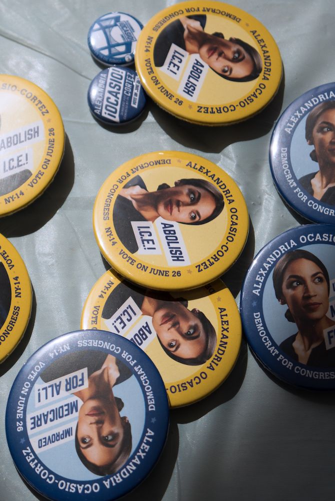
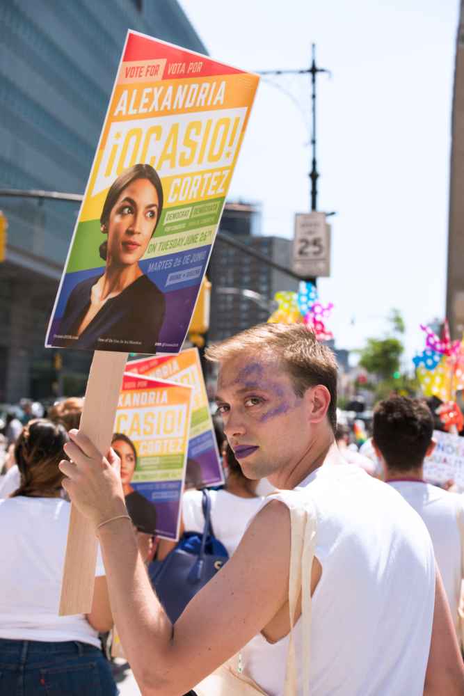
The poster became the focus for the campaign. It became iconic in the district, and people started talking about it. People were even taking them down and bringing them home, which the campaign had kind of a problem with. If you have that kind of success you have to run with it and keep using the poster, and keep using her face. But it’s using the face as the actual brand.
 I did notice little things about the face—like where the camera was angled, and how she was slightly looking heavenwards. To be honest, the shot seemed a bit reminiscent of old-style propaganda posters; it reminded me of WPA project kind of work. In this case, the aesthetic created a feel that was very human, but also sort of heroic.
Yeah, we used to call that the “hero” shot. The famed designer Jessica Helfand did a beautiful job of describing this concept in reference to a celebrated Susan Sontag piece on photography. In her essay, Sontag calls it “The Politician’s Gaze,” and it represents a look to the future.
It’s rare to be able to make the face into a logo—but that’s what happened here. It’s also rare to have someone owning and embodying that role the way Alexandria did—she looked so comfortable and natural in that role. That’s how I would try to explain it to other politicians and campaigns.
Now that you’ve mentioned it, I think “propaganda” is an interesting word. If you’ve read the book Propaganda by Edward Bernays, the core concepts he had initially outlined there have sort of been bastardized, and it’s become a pejorative. But, really, “propaganda” is just marketing. We’ve just changed the word and added all this baggage to it. Essentially, it’s spreading messages, and storytelling through images.
Now, how we interact with the idea of authenticity, I think that’s the question here. I think Alexandria had to be a good politician. She had to go out there and be open with her beliefs and vision, and say the right things in the right way. It was essential that she be an authentic person to back up the work we did for her image. Otherwise, it does look like “manufacturing,” and it does look like a cheap attempt. But, we’ve been seeing that story told by politicians long enough. In their attempt for “authenticity,” they often try to kind of go middle of the road. They roll up the sleeves on their white shirt, even though they probably wear a Rolex normally. They set that aside for the photo shoot in an attempt to look like “the every man.”
Yeah, this is like the wealthy Republican politician “posing in front of a pickup truck” to look masculine and distinctly like the “common man.”
Right? They stand by a pickup truck; they wear a cowboy hat for the first time in their life. Things like that—fabricated signals of authenticity—they’re all the things we’ve started to disregard.
So, if it seemed that in Alexandria’s case our references back to the WPA era and protest posters came off a little heavy-handed—there was definitely reason behind this. Most movements tend to have an urgency about them; they need context and reference points to trigger a response. We captured that urgency to tell her story, and we borrowed authenticity from leaders of the progressive past that truly believed in their causes. And by doing that, we were able to take that and change the vocabulary on top of it—which allowed the campaign to tell different, new, transformed stories—rather than the same old story everyone’s grown tired of.
Agreed. Let’s delve into the idea of “old and tired” a little more. It seems candidates and campaigns keep pumping out the same boring visual—there’s usually some form of variation of red, white, and blue colors, accompanied by stripes and stars. And so many protest posters go to that classic 2 or 3-color silk-screen style. In theory, there’s nothing wrong with that, but it has become kind of the “default” look. How do you break past that default? Is it the candidates that are driving it and the designers just accept those limitations? How do you change the language of political visuals?
That’s a big question. And you know, I think everything is variation on a theme for the most part. We’re diverging from everything. Nobody truly starts from scratch in a visual language. Someone showed me a logo the other day that was a specific cultural group of Obama. And Obama was sheared, rotated, and had the inverted exclamation marks. And I was like, “I don’t think I’ve ever seen that.” But it’s also likely we saw that at some point, and we absorbed that idea without knowing it. It’s really hard to put those things in their places and trace them back to a singular point of origin.
I guess my really long answer to your question is I think a good designer looks at a candidate— who they are, how they act, what they stand for—and tells the world that story on a first read. In a sense, the designer is the first point of contact—they lay the ground for the way the world gets to know that candidate. And when you dig deeper, it turns out to be a much bigger idea—the candidate has to be represented and seen as a person. And in order for that to be truly incorporated and felt in the eyes of the public, they have to also be that person in the real world.
I think the challenge we have ahead of us is in how to set up someone in a way that the public can understand their personality, where they’re coming from, where they’re communicating from. And it’s not an easy feat, because you don’t typically get six months. We knew Alexandria on a personal level for almost two years before we designed her campaign. That’s a huge benefit—one that we don’t often get with every incoming client. And knowing the candidate, getting a sense of who they are and what they stand behind—that’s important to creating any authentic design. We’ve turned down races because they told us there was no time for us to meet with the candidate. Well, how can we be honest in our messaging if we don’t actually know the candidate?
With Alexandria it’s safe to say you were working with someone who understands herself, her place in the grand scheme of things, her positions, and what the imagery you devised signals to people. But, that’s not always the case, is it? Many times, the candidate sees themselves as someone they are not—or there’s a disconnect between how they see themselves and how they are publicly perceived. How much does a candidate’s level of self-awareness factor into your work? Have you devised any ways of managing the chaos or sense of delusion that can come from the side of the client—where you have to not only work on the design, but also do some sort of reality check?
Well, that’s a good question. It’s for sure the type of situation that gets tackled on an individual basis. There’s plenty of politics in creative services in the first place, so it’s not all that different just because the client is in the business of politics.
As far as setting expectations, and managing stakeholders—I think so far we have been treated more as experts in our conversations since Alexandria’s success. Ideally, our success here would spread to other creatives as well, in that would trust and give up that control to their creative team. I think that’s what Alexandria did really well. It was, “You guys know what you’re doing; I’m not going to get my fingers all in it. I’ll tell you a few things here and there, and I’ll have a few comments.” Everything else was in our hands. If Alexandria had gotten super involved and micromanaged our entire creative process, it would only detract from all the other important things she had to do. And second-guessing our efforts would also chip away at the respect she has for us. Of course, it didn’t hurt that Alexandria generally has good taste—at least in my opinion. So, in this instance, it worked perfectly.
Alexandria’s really smart and really sure of herself—so she wasn’t threatened by any of our knowledge—and then she also put the pieces together really quick. So that’s another element that you can’t always account for.
Most politicians have big egos, so often they start messing with the stuff we develop to market them so that they can feel like it was their idea (when it wasn’t). They don’t have any expertise in typography. They don’t have any expertise in composition or color. Yet, they feel they need to interject because they’re the executive and it’s the “executive role.” The problem is, they don’t know how to let go and trust the people with expertise.
We have been lucky to be recognized for our successes and the successes of the candidates we provide support for. There’s a trust that’s building, and it’s helping negate that doubt many candidates have that they aren’t fully understood or presented properly to the public. Having this kind of success creates a level of trust in terms of public perception, and—hopefully—it allows candidates to have greater trust in their designers to take risks a little more often. Because we could use it, you know?
One final question, about your creative habits: do you have some sort of creative hack or work hack that you use on a regular basis as a way to kickstart the creative process or trigger inspiration?
I need to enjoy what I’m making, so for me it’s important to blur the line between work and leisure. I tend to consistently immerse myself in something that vaguely relates to an upcoming project in one way or another. Whether it’s watching a Terrence Malick film to study narrative pacing and composition, or reading about the obscure 17th-century polymath Athanasius Kircher to inform the use of cryptic symbolism—I’m always looking for an excuse to spend the time going in even deeper on a subject I’m interested in. I start by indulging those interests, and the act of working through the concepts and references often results in a complete misstep—but, understanding why that approach doesn’t work, more often than not, ultimately points me in the right direction.
Keep up with Scott and his work on LinkedIn and Twitter.
Illustration by Ewelina Karpowiak